Fortress Financial.
Brand Identity for a Mortgage, Protection and Wills Business
Fortress Financial is a start-up based in North West London where they assist their clients with mortgages, wills and protection needs. At the start of 2023, the founder reached out to rebrand the company as their old identity was no longer represented the company values.
The rebrand entailed a fresh and adaptive identity that can be used across multiple touch points, specifically for marketing collateral. The new identity portrays confidence, trustworthiness and security by closely stacking the two ‘F’s’ in the logo icon. To tie the whole brand together, we’ve paired the logo icon with a clean and modern geometric sans-serif font.
Our dominant brand colour, Midnight Blue, was drawn from the previous identity so there was some cohesion between the new and old. However, to keep the palette bold, we introduced the Golden Yellow and Washed Grey, which provides a corporate yet playful palette.
Logo Sketches
The Process
Brands Core Values:
Confidence
Trustworthiness
Security
With the brands core values defined with the brand personality of professionalism, I started to sketch out a few concepts of the visual identity.
Moodboard below
Brand In Action
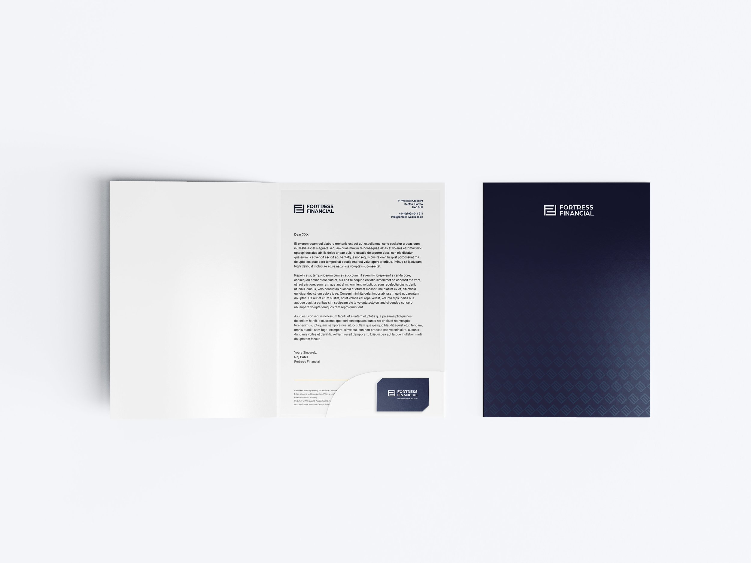
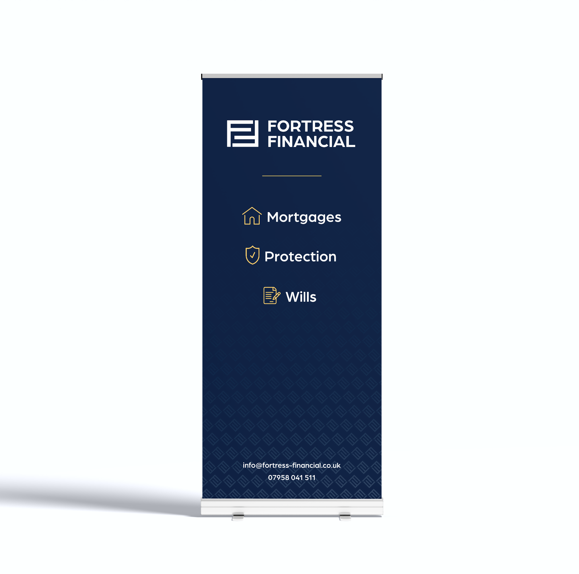
After developing the visual identity, I started to work on building out the brand language, including font pairings, colour palette and brand patterns. Once these assets have been created, I started to add all of these together to show the client what the brand would look like in action, by applying it to relevant print and digital materials, including business cards, letterheads, social media designs and much more.
Fortress Financial Business Card
Fortress Financial Flask
Fortress Financial Brand Guidelines
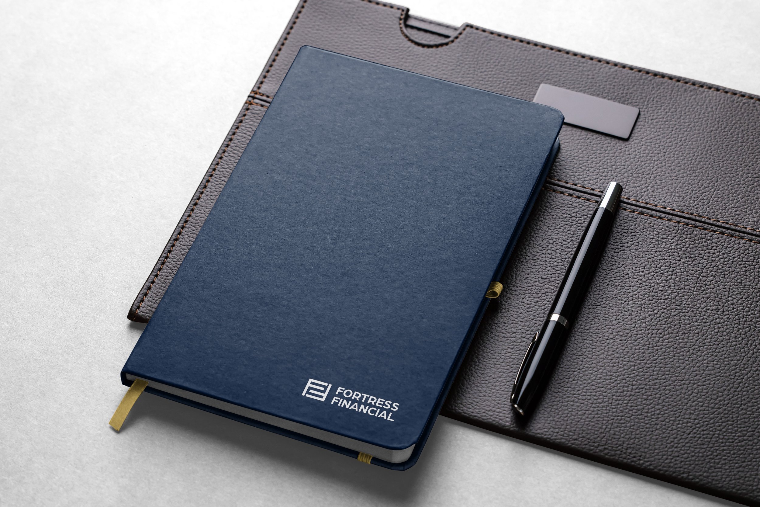
Fortress Financial Notebook
Fortress Financial Poster
Fortress Financial Presentation Folder
Fortress Financial Pull-Up Banner
Fortress Financial Mug
Fortress Financial Website Design
Fortress Financial Responsive Website Design
Fortress Financial Social Media Design
Client Feedback
“When we decided to rebrand Fortress Financial, Shivali was highly recommended. With her extensive knowledge and guidance on branding, she aided us through the rebrand. Highly recommend her service for anyone seeking a brand refresh.”
Raj - Fortress Financial


